Named in honor of the owner’s mother, Amelia’s Ice Cream Parlor mixes old-world charm with modern taste. Specializing in Mexican style ice cream, the client wanted a brand that referenced her native culture and also had a sense of femininity and nostalgia.
INSPIRATION, COMPETITOR COMPARISON, SKETCHES, & LOGO SELECT
The client provided some reference images as a launching point, and I developed two logo concepts for her to choose from, taking into consideration other local competing businesses.
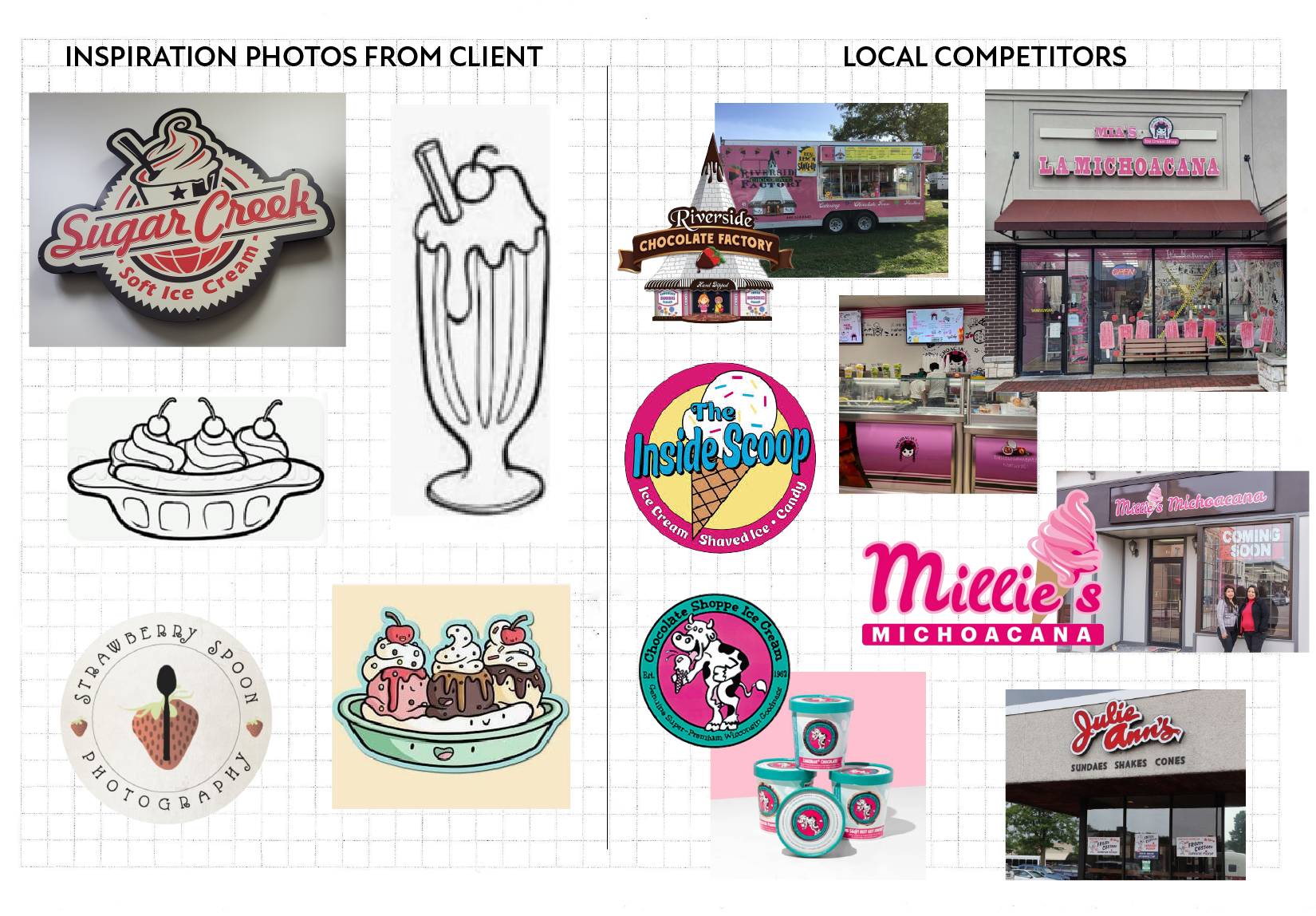
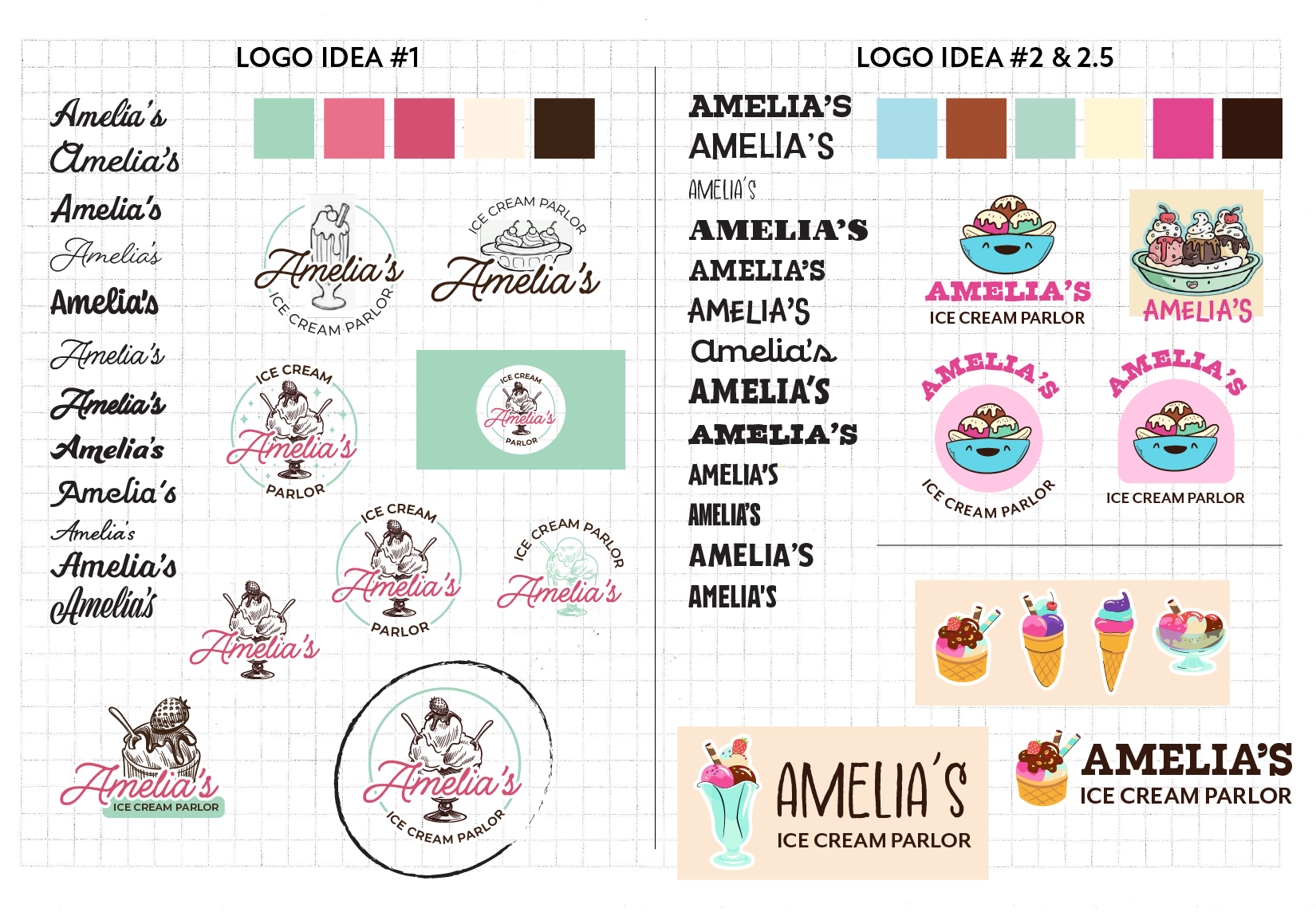
For the first concept, I leaned into the client's love of vintage illustration and opted for tints of red and green as a subtle nod to the Mexican flag. For the second, I emphasized her heritage through type and brighter colors. I sourced illustrations from SignElements and FreePik. Ultimately the client chose the first concept (circled), but with a cherry on top instead of a strawberry.
BRAND GUIDELINES
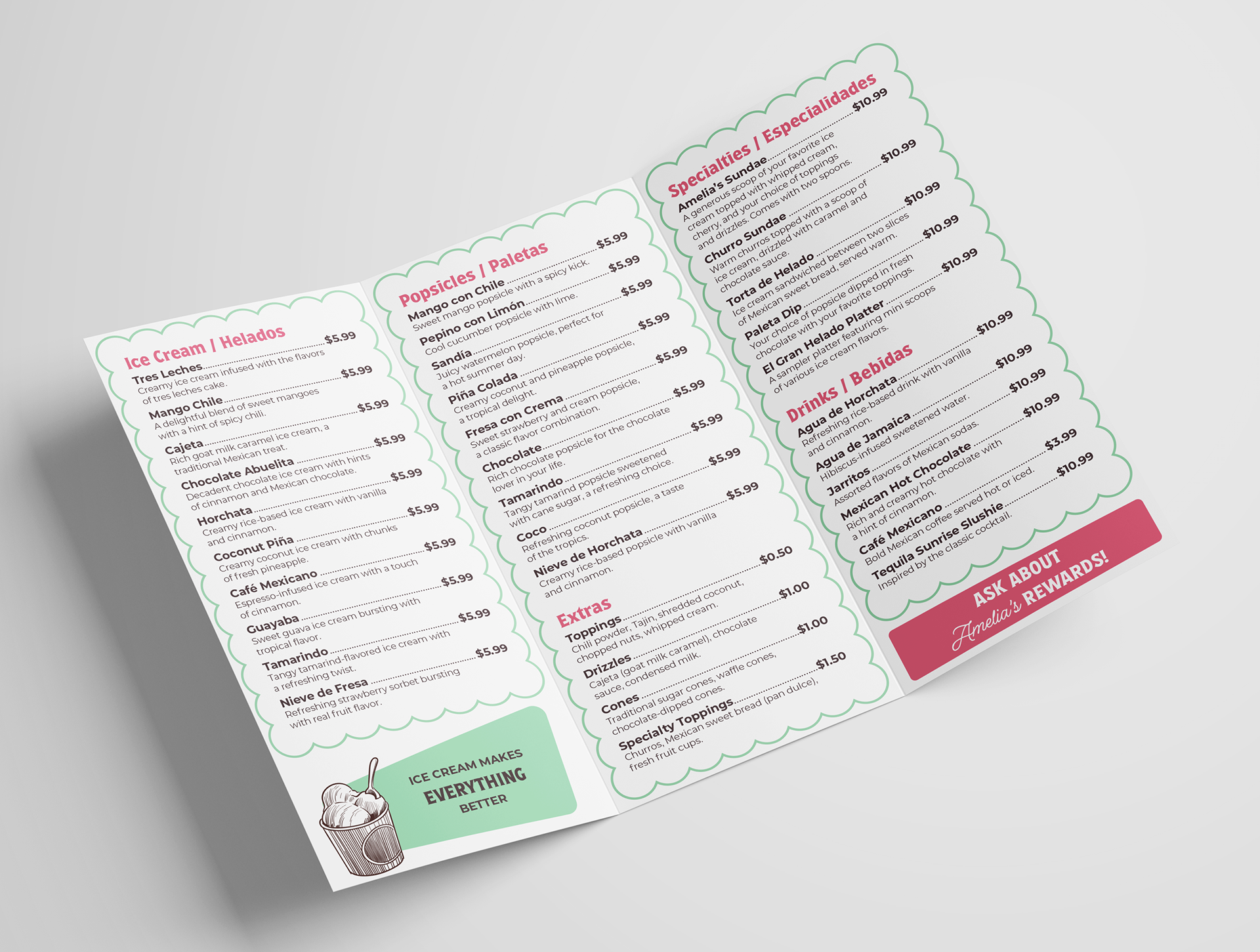
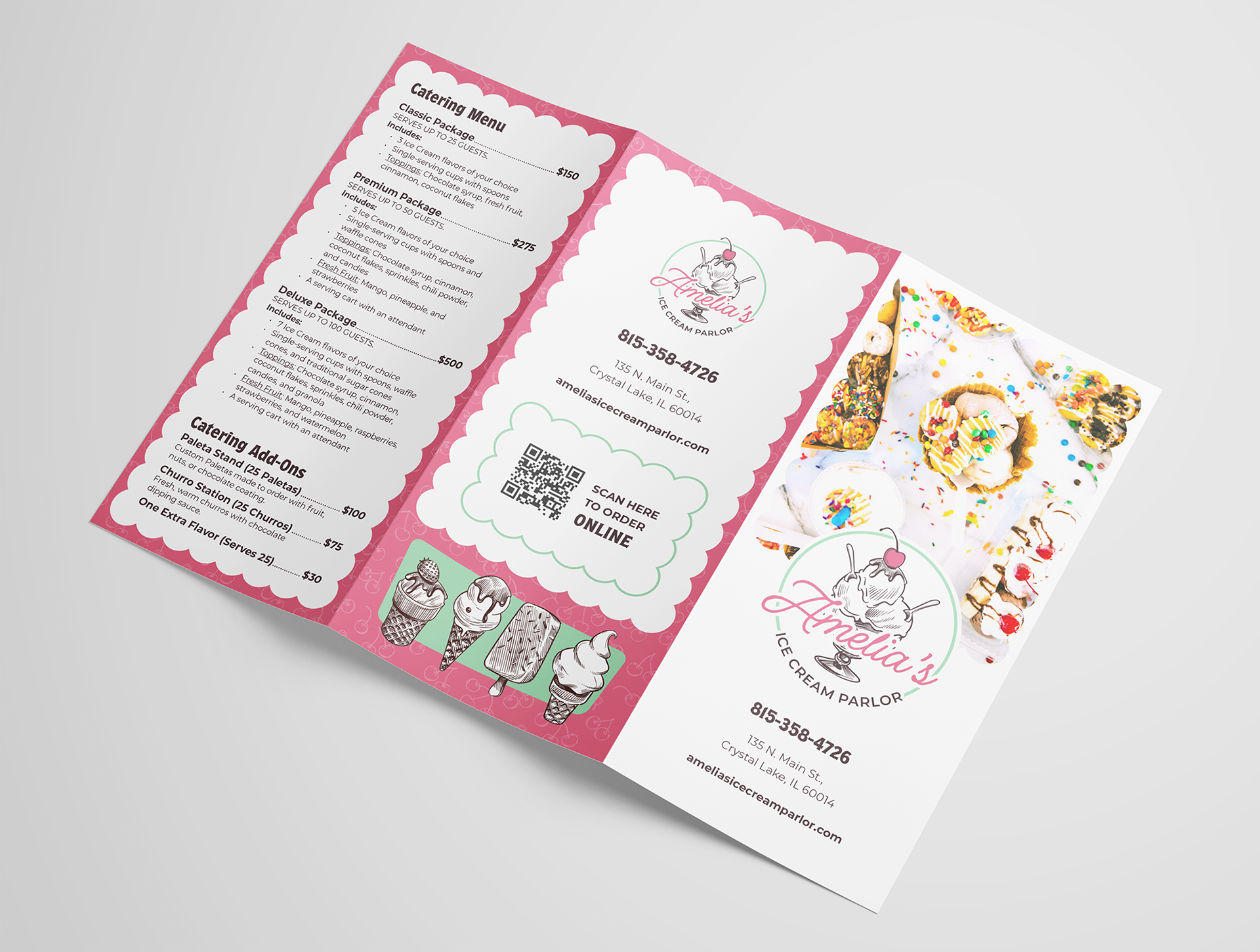
After the client selected the final logo, I expanded the brand guidelines and set out on designing the rest of the deliverables. A mix of approved and proposed deliverables are shown below. In the end the client loved her new brand and was set with a cohesive look for opening day.
LOGO + WORDMARK


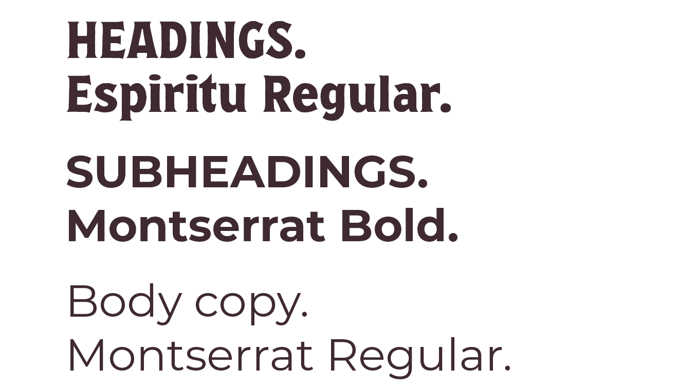
COLORS, FONTS, & PATTERNS


PRINT DELIVERABLES